

Left to right: Sivan, Tal, Chen, Noam, Przemek (from Dariusz Plewczynski lab) and Nili
We just had our first lab meeting – truly a landmark moment. Since it was also the first time the entire group was together, we thought we could use a little icebreaker. And what better way of getting to know each other than PCA (Principal Component Analysis) involving Darth Vader and Homer Simpson?
We created a Google Sheet table, where the first header row contained the names of the lab members, and the first header column contained a series of questions/statements that are answered with a number between 0 and 10. The questions ranged from “Distance of my residence to our lab (0-live in the lab, 10-galaxy far far away)” to “Deadlines are great / horrible (0-awesome, 10-hate them)” and “Hummus or sushi (0-hummus, 10-sushi)”. In addition to each lab member filling their own column, we also added columns of notable figures (Homer Simpson, Donald Trump, Darth Vader, Queen Elisabeth, Beyonce and Albert Einstein). We all filled the table online in shared mode with our laptops, leading to discussions on whether Beyonce prefers basic or applied research. So we ended up with a table in this format:
| Person 1 | Person 2 | Person 3 | Person 4 | |
|---|---|---|---|---|
| Question 1 | 0 | 5 | 2 | 8 |
| Question 2 | 10 | 9 | 9 | 6 |
| Question 3 | 5 | 4 | 9 | 1 |
Once the table was full and we looked at the results a bit, we analyzed the results using PCA. For those who are not familiar with PCA: We can think of each column (person) as a vector in a n-dimensional space, where n is the number of questions. In order to simplify the data, we can project it onto a lower dimensional space. For example, in order to visualize the data we can project it onto a plane (2D space). But there are many different planes we can project the data on, so how can we choose a good one? One possibility is to choose the plane in which the data has the maximal variance possible (intuitively it means the data will be as “spread” as possible). PCA can be used to find the plane which will maximize the variance and we can then project the vectors onto this plane (see a nice exposition on various interpretations of PCA here). The projected vectors will generally not give an exact representation of the data, but they might still be useful as a simplified representation of the data. In fact you can calculate what fraction of the original variance is capture by this representation.
We briefly went through the short python code (it was a good opportunity to talk a bit about code), and then ran it, which gave the following figure:
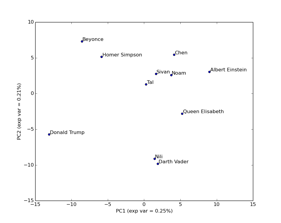
As you can tell from the fraction of variance explained by each component/axis (46% in total), this simplified view misses some of the complex structure of the data. This is an important point since often people can forget this and treat the projected data as if it were the original data. It is not. For example, looking at this plot you might think Nili is very close to Darth Vader. However, let’s add an additional component/axis:

Using the first 3 components, we now capture 66% of the variance, and get a better view of the data: Nili is actually quite far from Darth Vader. No need to worry about anyone joining the Dark Side just yet.
The code (including graphics) is available through our GitHub, feel free to share your own lab PCA.